If I were to mention the term “Ctrl+Alt+Del” to a relatively tech savvy person, most would quickly identify it as either that reboot command, or an unholy, bile spewing abomination from the ninth level of Hell. This week, we’ll be focusing on the latter.
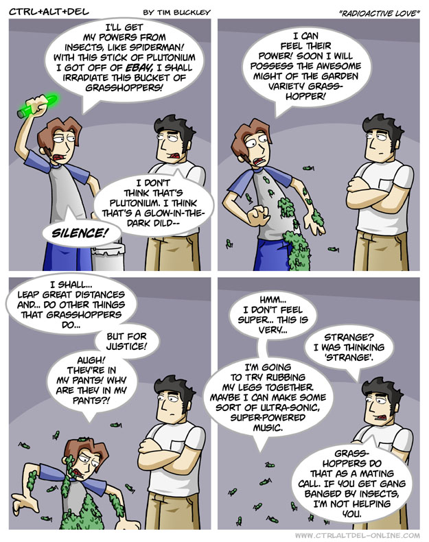
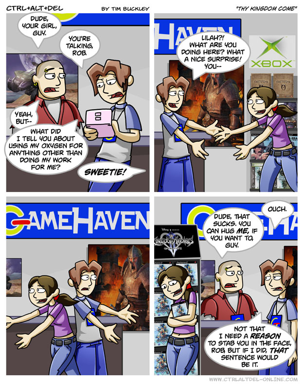
Needless to say, Tim Buckley’s Ctrl+Alt+Delete is one of the most followed yet critically lambasted and mocked comics you’ll find anywhere, with a hatedom that arguably outnumbers its actual fanbase. It even spawned its own short lived animated series, which by and large wasn’t any better received. At one point it was just as known for its forum conflicts and the “CADbortion” meme than it was for the actual strip. Does it really deserve all of the vitriol, poison tipped arrows and antitank missiles hurled in its direction? Well, as far as game comics go, it’s not on the level of Penny Arcade, which does a lot of the same things CAD does only better and more consistently. However, the reason for its infamy mostly lies in its earlier strips, which are plagued by repetitive art and an odd balance of poorly timed jokes and character dynamics I felt I’ve seen before.
Ethan, the creator’s Mary Sue, likes video games. A lot. As the owner of the Gamehaven shop, he’s obsessed with his hobby of choice to where he’s apparently discarded the more practical functions of his brain to make room for more geeky endeavors. Sadly, said functions include common sense, knowing how to properly live in and positively contribute to society, empathy, and the ability to put on dress pants. Personality wise, think of him as a cut-and-paste Peter Griffin esque moron with a gamer bent. Lilah, Ethan’s stereotypical too-good-for-this-idiot girlfriend (and for some unfathomable reason, his eventual wife), and his droll roommate Lucas serve as our straightpersons. There’s also the extremely secretive, Linux worshiping Scott, as well as Zeke- a robot compiled of X-Box parts. He’s more or less a literal snark machine with periodic dashes of Futurama’s Bender.
Prior to its grand finale, CAD spends a lot of time dancing back and forth between Buckley’s commentary on the game industry (in fact, we get literal commentary under just about every strip) and Ethan’s various misadventures, all within an R rating. The former is where it works best, though occasionally it feels like it tries too hard to shoehorn in something mildly offensive as if that’ll get a laugh on its own without context. Also, for some reason he seems to really love having someone getting hit in the face, shot or just horrifically injured as a punch line.
But it’s the dramedy aspect where it truly earns its lousy reputation. Most of the cast (sans maybe Lilah, but then again she seems to be attracted to extremely repellent men) isn’t likable enough to carry the heavier moments, and that’s due in part to them being used so much as unsympathetic comedy figures. The result is an ugly tone whiplash. What’s more, often it falls into a nasty trap where it awkwardly attempts to squeeze in a weak stab at humor during what could serve as an emotional peak, rather than letting moments breathe. On top of that, some of the morals come off clumsy at best and irritating at worse, notably an arc involving Lucas and his love interest wearing a fatsuit, in which the resolution seems to champion looks over personality.
Visually, CAD has kind of a bland look throughout its run. The shading seems off in a number of panels, and Ethan’s hair often resembles headgear prior to the art evolution. To be fair, it gets much more dynamic and pleasing to the eyes with much better detail, facial expressions and stronger anatomy over time. Until then, it constantly jumps back to one stock expression known as “B^U/Buckleyface”, which has reached a sort of legendary status. The layout and colors are pretty clean, but there’s a very cut-and-paste sterile feel through most of the timeline. It’s sometimes hard to discern how characters really feel at times, which gets distracting.
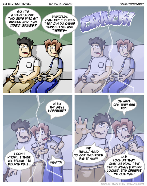
I’ll admit this take on “breaking the fourth wall” was cute, but stuff like this is few and far between.
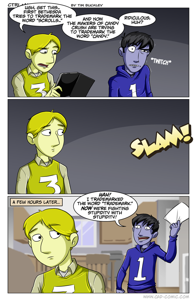
For the most part, CAD didn’t piss me off so much as it disappointed me. There are some moments where it’s genuinely funny and rare bits where the heartfelt moments do work, but the downside is that you’re gonna have to wade through a sea of crap in order to find them, not to mention the sluggish pacing. To the comic’s credit, it’s getting a lot better artistically and humor wise since the “reboot”, but I can’t recommend anything prior to that. Still, if you want to judge for yourself, take a look here.
/p


